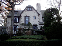
[Late. Sorry.]
"Today, I'll be writing a post about an architect named Ralph Johnson. According to his Wikipedia page, some of his most notable projects include Boeing's worldwide headquarters and a terminal (which one is not specified) at O'Hare International Airport. He has also designed a building called Skybridge, 22 West Washington as seen regularly on the local news around here (sort of), and this green skyscraper which is entirely one residence.
"How I came across Ralph Johnson? By finding a page about the surprisingly amusingly named Ralph Johnson Bunche House. Not to be confused with the Ralph J. Bunche House, which was the boyhood home of a famous guy from before my time named Ralph Johnson Bunche. Bunche's original home is now listed in the National Register of Historic Places, as is his later home, the Ralph Bunche House -- as the building is referred to by governmental documents."
Top, the Ralph J. Bunche House. Bottom, the Ralph Johnson Bunche House.
And then I finally realized Ralph Johnson didn't design the Ralph Johnson House, as the 1949 building is called on that webpage I found, at all. Nope, that architect was Harwell Hamilton Harris, whose Wikipedia page features a better biography than Johnson's, but a disappointing failure to clearly provide actual examples of his work. Fortunately, ArchitectureWeek provides nicely on that front.
Ralph Johnson House, by Harwell Hamilton Harris, at Los Angeles, California, 1949 to 1951.
Top, lower plan. Bottom, upper plan.
Top, lower plan. Bottom, upper plan.
Here, we have some design drawings which look like they were made on a computer. From 1949. Quite impressive, considering. I'm just sad the images aren't higher resolution.
Even with higher resolution, I wouldn't be able to figure out what that pipe is doing on both stories of the house, going through a lake or something. I can't tell what the circle to the left is about, either. But it's hard to go wrong with nice, simple walls and doors, plus tiny little furnishings which make it clear what many rooms are for despite any textual labels being thoroughly unreadable.
Note the bold lines which make some walls pop. Note the approach to drawing 'trees' from top-down in a clean yet detailed manner, as best you can at this size anyways. Note the lack of clear labeling for staircases and front and back doors, making the plan's functionality difficult to locate knowing not where it should be. Know that proper functionality does exist, seeing as Ralph Bunche lived in his new house for over thirty years.
Admire the drawings, and wonder how long they took to produce at the time and how long similar schematics would take to produce now.


